CLIENT // Prologis
TYPE // Internal application
PLATFORM // Desktop, tablet, mobile
TIMELINE // 6 months

CLIENT // Prologis
TYPE // Internal application
PLATFORM // Desktop, tablet, mobile
TIMELINE // 6 months
We started the project by first going out into the field and seeing how users were tracking these deals currently. Several attempts had previously been made to create a tool that would be in all-in-one place for everyone in the company to stay up-to-date on what clients and large deals were coming down the pipeline, but nobody wanted to use them as they were all very cumbersome and required you to be in-front of your desktop computer entering required fields that the users often did not have all the information for.
Next, we did a competitive analysis of the current unused tool called Deal Tracker and several base systems meant for large enterprise companies. The decision was made based on features and cost to move forward with SalesForce as the foundation for what would eventually become the Capital Pipeline and the sister-tool, Capital Forecast.
Working in a company that is worldwide, we had to take several new things into consideration through user research, ethnographic reviews, and culture studies. This also meant we had to create several variations of the same prototype based on language and the needs of individual regions.
For example, China’s land is all government owned, so the way they conduct business and track deals is different than how it is in America, a whole new set of metrics needs to be tracked and analyzed. On top of that, China, and most Asian cultures in general, consider it rude to use an electronic device when conducting business face-to-face, such as in a meeting. So, the ability to print screens quickly became an absolute necessity.
We began our initial sketches based on the capabilities of SalesForce along with what we heard to be the major needs by the field agents opting to go mobile-first responsive so that field agents could work on-site at a potential location.
Following business and architectures approval of the program and our sketches, we began to create wires and a simple interactive click-through to take out and test. We started with a specific deal type, Building Acquisitions, and created the flow of entering a new deal and then viewing that deal within the system for tracking purposes.

One of the biggest pain points we heard from the field-level users is that they would have only minimal information about a new building, and that they were scouting these building mostly from their cars on-site so they would write down whatever information they could on a piece of paper, napkin, or whatever they had close by. When asked why they didn’t use their phones to enter the deal onto the site, they responded that the site was clunky and impossible to use on a mobile device.
On top of the site not being responsive, the current system would often require the user to enter 30+ fields (out of a possible 500+ total) just to create the potential new deal. We could narrow that massive list down to only four required fields: Deal Name, Deal Type/Status, Market/Location, and Assigned Investment Officer/Agent. This meant that deals could now be entered in a matter of seconds, not hours.
Once the mockups were created, the team traveled around the globe for user-acceptance testing starting in America and Europe, and ending with China, Japan and Brazil. We conducted the testing using InVision and Lookback, which allowed us to record both the users face and comments as well as the screen touches.
Due to privacy, both with the business and its employee’s, those tests cannot be shown here.
Using this information, we could compile the footage and timestamp exactly when and where the users were getting caught up. We took this information to architecture and development to back up our request for certain custom components to be implemented, such as a custom filtering system separate from the SalesForce default.
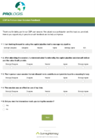
We also sent out a survey to the users, requesting feedback on their likes and dislikes about the prototype. This information was compiled into a report given to the rest of the team and stakeholders and led to many approved changes in the system before the final launch occurred.

Unfortunately, I was unable to attend the official launch of the Prologis Capital Pipeline, however feedback did come in through my former team lead that it was incredibly well-received by the business, and it has been actively in use since Q4 of 2016. The sister project, Capital Forecast, was developed after a very successful round of user-acceptance testing, and has been in use since Q2 of 2017.