CLIENT // CACI
TYPE // External application
PLATFORM // Mobile
TIMELINE // 6 months

CLIENT // CACI
TYPE // External application
PLATFORM // Mobile
TIMELINE // 6 months
One of the few public-facing applications in the EdgPortfolio, EdgGuide was a somewhat interesting accident that occurred when one of the engineers wanted to see what his cat’s did during the day, so he affixed location sensors in his apartment and added a tracker to his cats collars. This, combined with a request from a visually impaired user who was friends with another of the LGS employee’s led to a new idea…
The idea was simple; he wanted to be able to experience the museum the way his young son did. But his son was often so overwhelmed to explain to his dad what he was seeing and point him in the actual direction of the exhibit. So, the question was, could we take the cat tracker idea, and incorporate haptic feedback into a wearable device, along with a geofenced location app that provided detailed information of each exhibit, to give the visually impaired a way to experience the museum the way they want.
The first step was to talk with several visually impaired users, asking them what apps they use and like currently. I would also watch them use these application and ended up putting my own phone into the accessibility mode for awhile to experience it for myself. The overall feedback we got is that Apple is far and away the leader in this field, which led to my research on what Apple had done to pave the way.
Watching a visually impaired user navigate their iPhone is truly something special and unique, they don’t follow the same gestures that those of us with sight do, and instead use a series of long drags or holds, followed by a single or double tap over the screen when they hear the option they want as it’s being read to them. And they don’t have the information read to them at normal speed, the audio is often presented at 4-5x that of normal speech. They have become accustomed to this and actually prefer it.

Designing for the visually impaired actually just uses the base principles of wireframe design as the actual visual design; high contrast black and white, not a lot, if any, color. Not all users are completely blind, and those that have some sight prefer the high contrast, larger touch targets and font sizing.
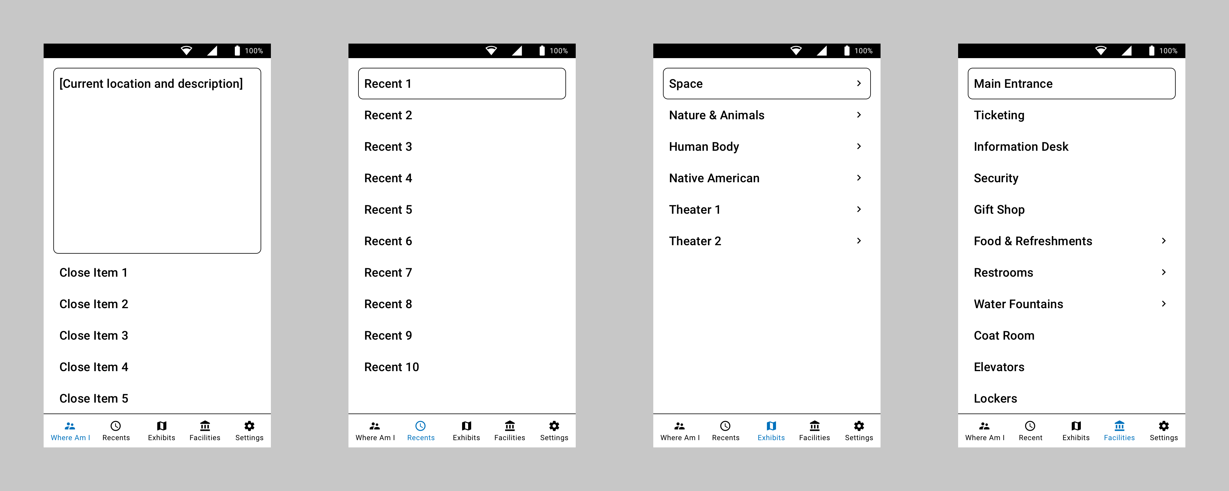
The second step was to identify and map out the navigational pattern. And since the users had identified Apple as the gold standard, I began to ask which apps they used most often. Contacts/Phone was one of the most common, as texting is not as preferred if a live conversation is an option. I took the basic five button bottom navigation of the app, and morphed it to work with navigating a museum. Giving them the ability to drill into any areas exhibits, areas of interest, and common facilities like food and the restroom.
With the base idea built, we started testing the app with users in our lab. To make the navigational portion work, we also had a wearable device that provided haptic feedback to let the user know if they needed to go left, right, forward or stop. The original device was worn as a chest rig, but we knew they didn’t want to feel constricted or look different than anyone else wandering the exhibits. So, the next step in the product design was to figure out a less obtrusive device.
We ended up going with dual bracelet style sensors, one worn on each wrist, that would provide the haptic feedback required; left for left, right for right, and both pulsing as various speeds to let the user know how far they had to move forward. This, combined with the users own headphones, provided the wearer a way to navigate the museum and receive the information through the app about exactly what they were standing in front of.
The biggest addition and most used feature was the “Where am I now?” idea. As we watched the user, especially with their children or families, they would be pulled by them constantly to the next thing. So instead of making the user navigate to the exact piece from a list, we just reversed the idea of navigation and provided the exhibits they were most closely standing by, which allowed them to begin hearing the description much faster.

Testing was done both in our lab and in the museum. We tested both the mobile app and wearables with the engineering team to start, blindfolding the user and navigating around the lab. We very quickly learned that we cannot mimic how well and independently actual users move around with the device. Engineers were all scared to move at a normal speed, fearing the app wouldn’t work and they would run into something. When we had actual visually impaired users test it, we noticed how they incorporated their walking canes in immediately and just took off without issue.
Due to privacy, both with the business and users, those tests cannot be shown here.
Knowing we had a functioning app and haptic sensors, we began working with the Denver Museum of Nature and Science to get some real-world usage. It’s still being tested there currently with the hope to expand it across all exhibits in the very near future!